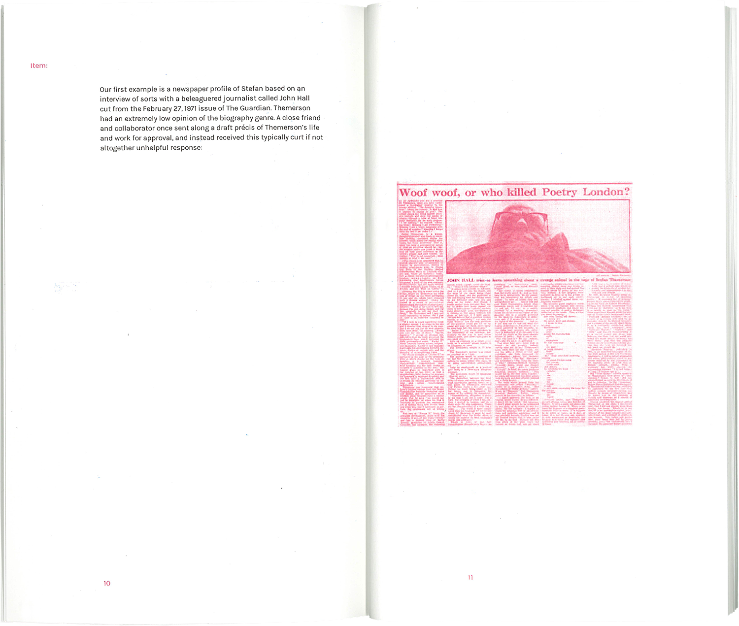
︎
Improvements type design (2022)  A more cohesive digital version of a wobbly font found in a 1951 wood type catalogue. The type specimen uses phrases from self improvement websites.

Super-human humanities illustrations (2023) Illustrations for an article by Charles M Stang on religious education, transcendence, transformation and geometry. Made at TANK magazine while on the design team with Michael Wallace, Otomi Larcher and Weronika Uyar, art directed by Sohrab Golsorkhi-Ainslie Animation used to generate print illustrations.

So-Called Ephemera (2021) A bootleg design of an essay by Stuart Bertolotti-Bailey, originally published by the Serving Library. The image position responds to the paragraph length on the opposite page, so that when you flip through the book, the images move around like loose sheets of ephemera. The pages are bound with a single staple in the middle of the spine.


Talking To Writers (2021) A collection of interviews designed in a system of 3 layouts, held together with an elastic band. The colours of the booklets are taken from linguistics diagrams.


Corner of my eye (2025)  Exhibition poster

 Music video for Orange by Bobby Kakouris (2020)  See full animation here.